To kick off our discovery meeting, we went through some exercises with the Almarfa team to better understand the main visitors of its website and the information they were looking for on the site. The main objective of the site was to reflect a certain company image that overseas, local and business partners as well as healthcare staff and industries could confidently rely on. Read more
A questionnaire was used to capture requirements of the new site. The new site was to provide information about the company and the product range as well as handle online requests and had to be updated occasionally. Links to websites of competitors were provided for reference. The website was to have a blue color scheme to reflect high-tech and medical technology and also give a professional and artistic feel. Functional requirements such as screen resolution, photograph transitions and the use of flash for the introduction were also determined. Although Almarfa had an existing website prior to approaching EBOX® , they waited for our designs before considering to include parts of the existing website.
The site targeted a wide range of audience from top healthcare professionals to medical businesses and manufacturers, both local and overseas.
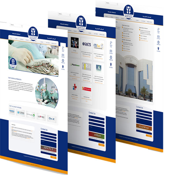
A PowerPoint Presentation containing the site structure and business models was created, covering Home, Profile, Affiliations, Products e-Catalogue, Our Clients, Latest News, Useful Facts, Order Online, Contact Us, Site Map, Hosting Package and Online Visitor Statistics Tracking and shared with the client for approval. A few details about the layout of the homepage and subpages were given. A flash animation was to be created to give an overview of the company. Material to be included was to be provided on a CD, along with brochures to be scanned.
Having gathered the requirements, we set out to start our new journey.


